SLU Logo Guidelines
This official guide has been developed to help you understand the Saint Louis University brand. It outlines the standards that will ensure the integrity of SLU’s visual identity as we work together to convey a unified and compelling message about this great institution.
For questions about the Saint Louis University Visual Identity Guide, email Matt Krob, director of design services, at matt.krob@slu.edu.
University Logo, Wordmarks and Lettermarks
Released in November 2015, Saint Louis University's logo is our symbol (fleur-de-lis in shield) integrated with our institution name. SLU's official logo system was designed for use (and legibility) across every touchpoint. Any variations must be approved by Marcom’s director of design services.
Logo
Lettermarks/Wordmarks

![]()
Logomark

Billiken Athletics Logo
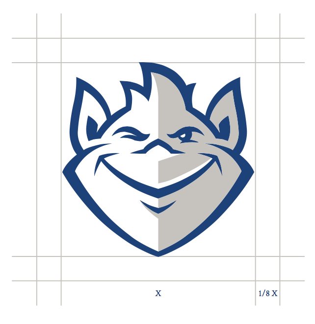
Updated in 2015, the Billiken is Saint Louis University’s official mascot. A unique good-luck figure who represents things as they ought to be, the Billiken should always be represented as shown, with no alterations or additions and always with the shading, wink and other key facial features.
The recommended clear space is 1/8th the width of the Billiken.
Logo Usage Guidelines
Logos require a minimum size to ensure maximum legibility and to keep the integrity of the University's mark intact. The primary logo may be reduced only to a minimum of 0.75".
Primary Vertical
The primary logo is the vertical centered logo.
Horizontal Variations
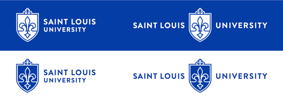
The two horizontal variations, center-aligned and left- aligned, can be used wherever necessary, depending on the space and medium. There are different logos that can be leveraged at specific sizes to uphold the presence of the brand. When smaller sizes are needed, wordmarks or logotypes can be utilized and, in extreme cases, the logomark/symbol alone may be used and reduced to 0.25".
Maximum legibility is also required for online usage of the logos. The minimum size requirements for all logos can be found below.
 Minimum width: 75 px or .75''
 Minimum width: 100 px of 1''
 Minimum width: 175 px or 1.75''
 Minimum width: 75 px or .75''
 Minimum width: 125 px or 1.25''
 Minimum width: 30 px or .30''
 Minimum width: 25 px or .25''
 Minimum width: 50 px or .5''
To maintain proper and maximum visibility, logos require ample space surrounding them, known as clear space. The height of the clear space for the logos and logomark correlates with twice the height of the crown. Keep this space open and clear as shown above to maintain the integrity of the logo and brand. The clear space for wordmarks or logotypes is the height of the letter "S" around.
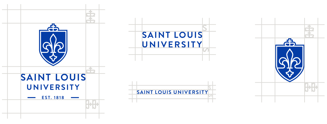
The logo should be prominently featured on all mediums and communications. The size of the logo should be appropriate to the size of the medium or media.
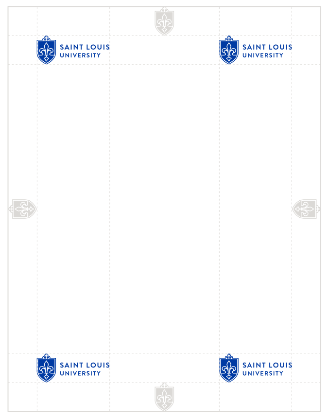
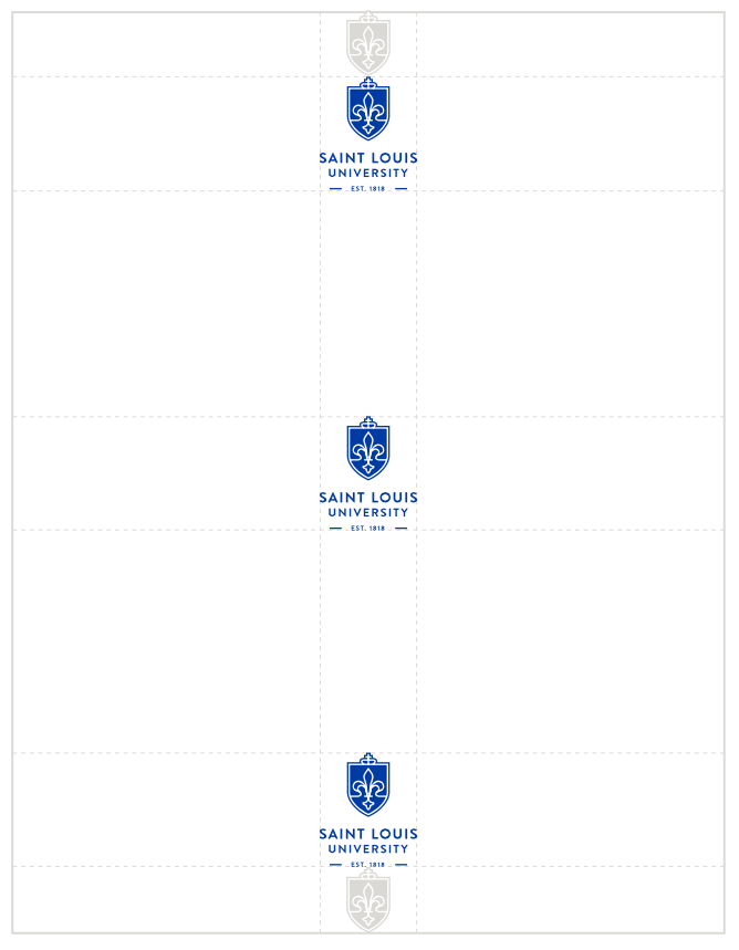
To create consistency, there are only a few locations the logo is allowed to be featured: any of the corners or centered depending on the logo, the content and what the piece is communicating. The logomark or shield should be used to create consistent margins throughout all materials as seen above. For printed materials, the logo should never be larger than 20 percent of the page. For interactive material, it entirely depends on size and legibility.
Logo Lockup System
A lockup system has been created to form consistency throughout the Saint Louis University brand. The logo lockups should be used across Saint Louis University's schools/colleges, divisions, departments, etc. (i.e., College of Arts and Sciences). This cohesive system strengthens our overall brand and image.
All guidelines that apply to all University logos also apply to these brand-specific marks. To inquire about a lockup for your unit, email Matt Krob, director of design services, at matt.krob@slu.edu.
University Seal
The University seal is used to authenticate the highest official University documents (e.g., diplomas, presidential items and legal documents). It is used as the watermark for all official University stationery items. The University seal should never be substituted for the Saint Louis University signature or logo.
Logos for Time-bound or Annually Occurring Events
Separate logos may be considered for time-bound or annual events but must be approved by the Division of Marketing and Communications. These could include fundraising campaigns, homecoming, Fall Welcome, the bicentennial, etc. These logos should:
- Use approved University fonts (Brandon Grotesque, Crimson and Archivo Narrow), unless there is a clear strategic reason not to do so.
- Use approved University colors. New logos should be largely SLU blue and white with a secondary accent color of college church gray. Secondary color palette and any additional colors should not be utilized unless there is a clear strategic reason to do so.
A version with the University name must be created. Additional graphic elements should always work in a complementary — and not competitive — relationship with the University logo.
Contact a member of the design services team to discuss objectives, expectations and process. Time-bound logos must adhere to brand standards described on the brand guideline pages on slu.edu and appropriately represent the University.
Sub-brand Logos
Logos that are not time-bound may be considered but must be approved by the Division of Marketing and Communications. These logos should:
- Use approved University fonts (Brandon Grotesque, Crimson and Archivo Narrow), unless there is a clear strategic reason not to do so.
- Use approved University colors. New logos should largely use SLU blue and white with a secondary accent color of gray. Secondary color palette and any additional colors should not be utilized unless there is a clear strategic reason to do so.
A version with the university name must be created.
A tiered system of sub-brand logos has been developed and is described below:
- Tier I: This program or initiative is of high priority and targets a wide-reaching and largely external audience. Solution: Creation of an expansive identity system that works in conjunction with university branding. Example: The President’s Circle
- Tier II: This program is of moderate priority. Targets an external audience but one that does not contain a broad demographic crossover. Solution: Creation of a wordmark that works in-line with university branding and might contain limited graphic elements. Example: BOLD (Billikens of the Last Decade)
- Tier III: This program is low in priority. Audience is internal or a narrowly focused external group. Limited built out strategy available at time of logo request. Solution: Creation of a wordmark that works in-line with university branding but contains no graphic elements. Example: STAT (Students Today, Alumni Tomorrow)
Graphic elements should be kept to a minimum and should be proportional to the impact and importance of the group the logo is to represent. Graphic elements should always work in a complementary — and not competitive — relationship with the University logo.
Contact a member of the design services team to discuss objectives, expectations and process. Custom logos must adhere to brand standards described on the brand guideline pages on slu.edu and appropriately represent the University.
Co-branding
A small number of entities at the University operate under the auspices of, or in conjunction with, external entities such as agencies of the federal government. Those that do may be granted use of the external entity’s logo in conjunction with the University logo.
Co-branded logos follow a standardized format, with the co-branded entity or organization's icon appearing between the SLU logomark and wordmark. All co-branded logo artwork is created, managed and maintained by the Division of Marketing and Communications.
Eligibility Requirements
To receive a co-branding exemption, the following requirements must be met:
- Entity must have a permanent contractual connection establishing them as a joint entity between the University and an external entity.
- Entity must detail why the inclusion or use of a custom logo or mark will benefit their business objectives more than using the standard SLU identity system.
- Entity must receive a written recommendation from its dean or vice president.
Use Guidelines
Upon approval of a co-branding exemption, the co-branded logo may be used under the following circumstances:
- Approved co-branded logos may only be employed by those groups that meet requirements and have received approval from the Division of Marketing and Communications.
- Approved co-branded logos may be used for marketing, communications and promotional purposes.
- Approved co-branded logos can be used with or without an accompanying wordmark identifying the entity.
- Approved co-branded logos may be eligible for use on university business cards and/or letterhead. Approval and design must be coordinated through the Division of Marketing and Communications.
- In all other aspects, co-branded logos follow the same usage guidelines as standard University logo signatures.


